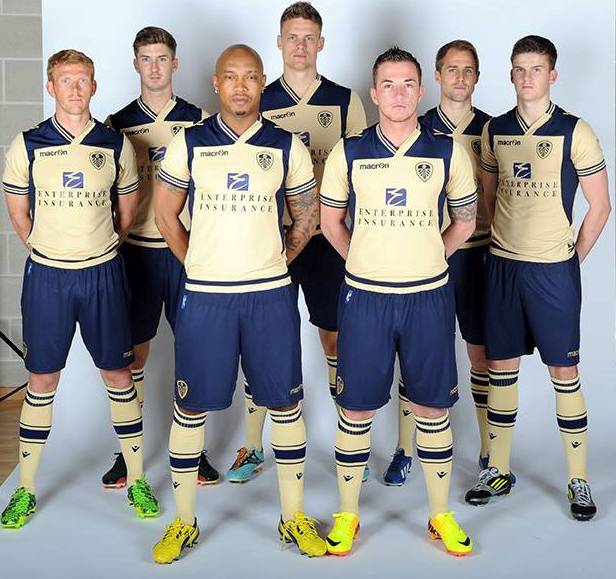
Leeds United Away kit 2013/14

Leeds United news here, transfer rumours, club affairs, players, fans, etc.
Specific match discussions should go in the category below.
User avatar
The Johnson
Raich Carter's Contract Agent
Posts: 3739
Joined: 11 Nov 2009, 05:08

Re: Leeds United Away kit 2013/14

Post by The Johnson »

SMorientes wrote:
Also, I wouldn't say it's a variation on blue and yellow, it's two new colours, not the right ones. Replace them with blue and yellow and people might be happy.

but that doesn't make it a great kit, that will just be happy memories overriding the dislike of this beige thing that's coloured like a bland golfing polo shirt.
It is gold and blue, about as close to yellow and blue as you can get without it being yellow and blue. I feel like people are so hung up on tradition, you know what, it is a nice, modern version of our club colours. Granted, if we had gold and navy on our home kit, it would probably be a different story. However as an away, alternate colour strip, it is more than passable and not 'the worst ever' as I have seen mentioned.

And I don't think it is, or ever will be, a 'great kit,' I never said that, it just is nowhere near as bad as people are saying.
Deleted User 728

Re: Leeds United Away kit 2013/14

Post by Deleted User 728 »

I hate it :evil: :evil: :evil:

I didn't mind the blue one yesterday that turned out to be a spoof - at least it had a bit of style, by being a rehash of the Ajax strip (even more apt this season given our home kit looks like a pack of Embassy).

But this .... jeeez.
That collar is just wrong.
The colour is also wrong. I dislike cream as I think of it as a non-shade and this is so far off "gold" as to be almost magnolia. It reminds me of that woodchip wallpaper from the 70s ...
The stripey trim looks like it's been lifted from a cheapo pair of Woolies trainers from when I was a kid and the daggers down the sides of the chest are just weird.
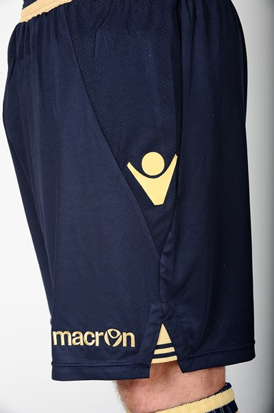
The shorts on their own are alright, I guess ... but I just can't get away from that collar. The whole of the shirt looks like a bloody pajama top from the kids section of the catalogue.

Please. Give me anyone but Macron. I really dislike their templates. I really dislike their colour schemes. I really dislike their details and I've had enough of them now ...
Deleted User 2

Re: Leeds United Away kit 2013/14

Post by Deleted User 2 »

The Johnson wrote:
SMorientes wrote: It is gold and blue, about as close to yellow and blue as you can get without it being yellow and blue. I feel like people are so hung up on tradition, you know what, it is a nice, modern version of our club colours. Granted, if we had gold and navy on our home kit, it would probably be a different story. However as an away, alternate colour strip, it is more than passable and not 'the worst ever' as I have seen mentioned.
What's actually modern about it though? I mean, I agree, it's nothing to lose sleep about, and of course it's a highly subjective thing, but it doesn't feature club colours, and they are not mere version of blue and yellow. It's a poor cream with an acceptable navy blue, combined via a ridiculous array of panels, trims and collar details that are just pointless. It's not bad in itself, but it's a whole new palette of colours just for the sake of it, in a completely new layout that's related more to a random training kit rather than the current or any previous Leeds shirt, just for the sake of it. It's just rubbish.
User avatar
Sheepy
LUFCTALK Admin
Posts: 14444
Joined: 17 Apr 2013, 12:32
Location: Rothwell

Re: Leeds United Away kit 2013/14

Post by Sheepy »

I'm not a big fan, infact for all the moaning I did about the black one 'not being Leeds', this is even worse.

Its not just the colour, its the design, it just looks half-arsed like someone realised they had forgot to design it and did it over a spare weekend.

The lass in the shop told me it was 'like a gold colour', she was right. Its cream.
Deleted User 728

Re: Leeds United Away kit 2013/14

Post by Deleted User 728 »

Image


Doesn't look much better in our normal colours either, does it ??

It's that damn pajama collar ! :evil:
Deleted User 2

Re: Leeds United Away kit 2013/14

Post by Deleted User 2 »

rigger wrote: Doesn't look much better in our normal colours either, does it ??

It's that damn pajama collar ! :evil:
And the panels. Your yellow, without the panels on the shirt, and with a plain v-neck collar. Jobs a gooden!
Deleted User 728

Re: Leeds United Away kit 2013/14

Post by Deleted User 728 »

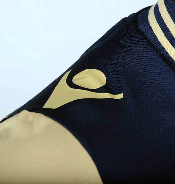
More and better images from FKN:

Image

Image

Image

Image

Image

Image
Deleted User 728

Re: Leeds United Away kit 2013/14

Post by Deleted User 728 »

Judging by the shot of the shorts, Ross quite likes it though :D
Deleted User 2

Re: Leeds United Away kit 2013/14

Post by Deleted User 2 »

rigger wrote: Image
Just look at the Enterprise logo being a completely different blue yet again!!! :evil: :evil:
User avatar
SMorientes
Dick Ray's Talent Spotter
Posts: 1845
Joined: 16 May 2011, 14:51
Location: Armley

Re: Leeds United Away kit 2013/14

Post by SMorientes »

rigger wrote:Image


Doesn't look much better in our normal colours either, does it ??

It's that damn pajama collar ! :evil:
It does look better, but still not great, I'd say it's the shoulder panels that really grate on me, the collar I can handle, even the daggers down the side would look ok without the top 1/4 of the shirt just being a block of colour. Like sheepy says it just looks half-arsed. Actually, on that picture of them all emerging from the tunnel, the panelling makes them look like they're all wearing backpacks. School bags on their backs on the way to school in the morning.
"Whenever people agree with me, I always feel I must be wrong."
Post Reply